Make image matching 1500% easier to find
I made the Image Matching modal easier to find by 1500%, while improving the experience of viewing images related to an infringing item.
Analysts' work is slow and manual
Infringements can damage a brand's reputation and hurt consumers with dangerous goods. The company helps brands identify and take down infringing items, but analysts' work can be slow and manual.
Reviewing images faster
I was working on an easier way to review images that belong to a suspicious post or website.
A suspicious marketplace post could have 5 to 15 images on average, but a suspicious website could have 50. How could we show all these images alongside insights that help analysts review and label infringements quickly?
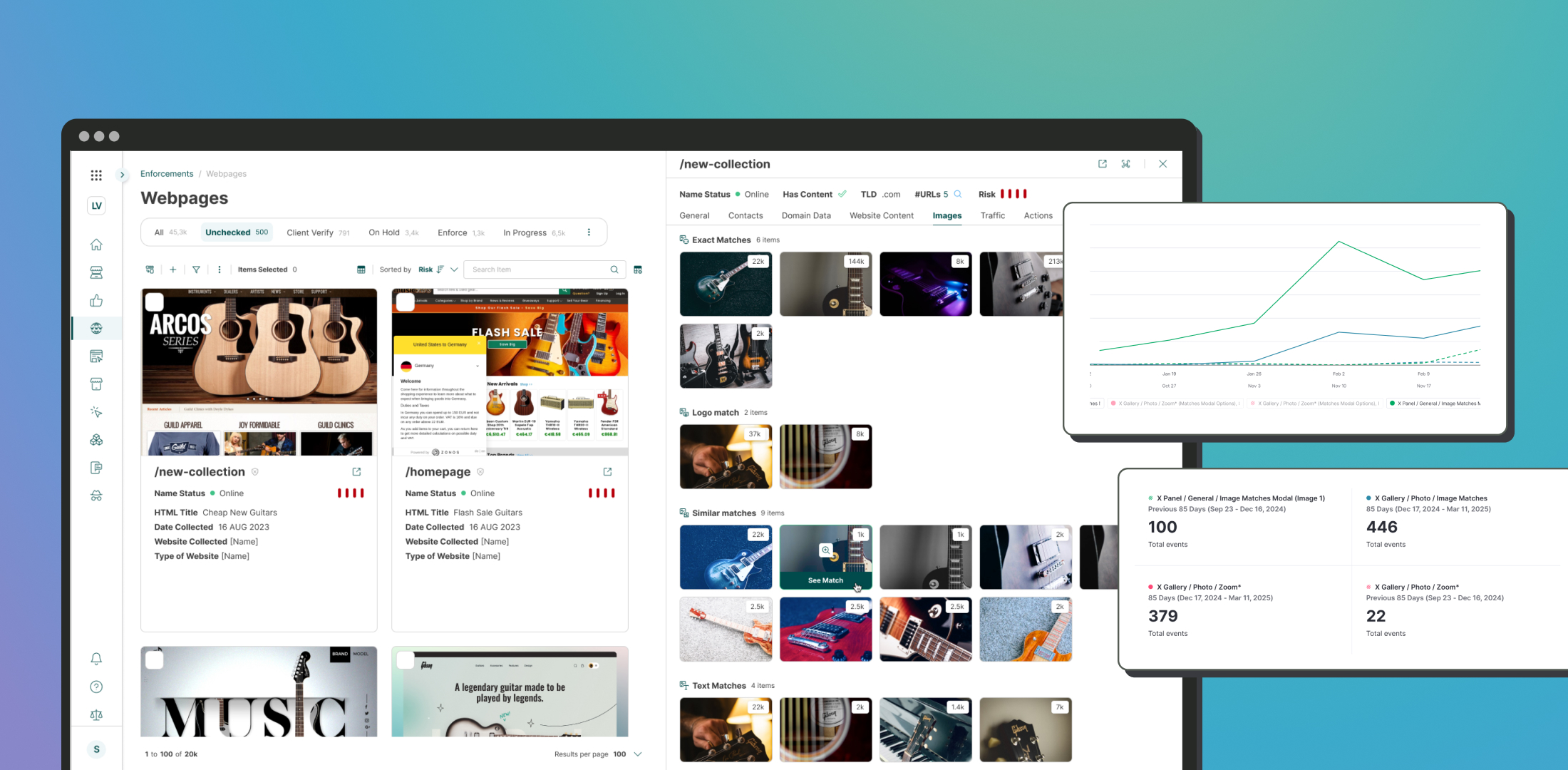
Deep-diving into an image through the Matches Modal
While I was doing the quick improvement above, I saw that each image allows the user to:
- Zoom to review details.
- Open the Matches modal that deep-dives into why the image is suspicious.
(Did OCR detect a suspicious keyword? Was it a logo? Was it similar to a known official image?)
This helps analysts understand matching reasons, unmatch incorrect ones, and find similar images to flag more posts.
Nobody knew about the Image Match modal
I shadowed colleagues who worked with the system. Nobody knew about this modal. Pendo Analytics confirmed that usage was near zero.
The change that increased discoverability by 15×%
I added a "See Matches" button, visible on hover. This simple addition significantly increased interaction with the modal.
Opens plummet to zero
From a few opens per day, the stats plummeted to zero. It turned out the data segments tracked only internal users like devs and QA. Once fixed, usage surged.
Much more to learn!
Next steps would have been to study how people use image recognition filters. Why didn’t users unmatch images? Were matches correct? Did people understand the feature? The software was discontinued after an acquisition, so the exploration stopped there.
Bonus level: the design system
Efficient, scalable design systems are essential. I started optimizing components in Figma and worked closely with developers to build them in Storybook.